PLACED WHERE
THE EYE GOES.Advertising & Design in Hyderabad
Purposeful, minimal, functional — design where every element exists for a reason, placed to carry the eye from first glance to action.
Every element earns its place.
Purposeful, minimal, functional. Nothing decorative, nothing shouting — each element exists for a reason, arranged into one seamless visual journey from first glance to action.
One idea. Three genuinely different problems.
A hoarding, a feed and a printed page are three different problems — so the idea is rebuilt for each, never just resized.
Design that earned the look.
A rolling cut of campaign and ad creative — built to stop the eye, then move it.






What advertising and design work actually is
Advertising design is the work of arranging a message so the eye picks it up in the order you intended. A viewer does not read an advertisement — they scan it, in about a second, and they leave with whatever that second gave them. The job is to decide what that is.
So the mark, the headline, the image and the action are not placed where they look balanced. They are placed on the path the eye actually travels, which is why a layout that looks busier can convert better than one that looks calm, and why the prettiest version of an ad is frequently not the one that works.
What you get
Campaign and advertising work is quoted per brief, because a single press ad and a launch running across print, outdoor, feed and email are not the same job. Most projects draw from the list below.
Campaign key visual
The one idea the campaign is built on, designed as a master layout every other piece is derived from rather than loosely resembles.
Press and print advertisements
Full-page, half-page and strip formats, built at the publication's specification and supplied print-ready.
Outdoor and hoarding artwork
Designed for the distance and the speed it will be read at, which usually means less on the board than the brief first asked for.
Digital and display sets
Banner and display sizes, feed and story formats, built as a set so the campaign stays recognisable as it changes shape.
Launch and festive creatives
The occasion-led work that carries the same identity as everything else instead of arriving looking like it came from another brand.
Copywriting
Headline and body copy written with the layout, not poured into it afterwards — the line and the space it sits in are one decision.
Presentation and pitch decks
The document version of the same argument, built to be read in a room where you may not be the one presenting it.
Adaptations and artwork files
Every size the campaign has to appear in, rebuilt rather than resized, plus the packaged artwork and fonts a printer or publisher needs.
How the work runs
One idea, then a rebuild for every place it has to live. A hoarding, a feed post and a printed page are three different problems, and treating them as one file at three sizes is where most campaigns quietly stop working.
ObjectiveDays 1–3
What has to change, for whom, and how you will know it worked. An ad meant to shift stock and an ad meant to build recognition look different, and agreeing which one this is prevents an argument at the review.
ConceptWeek 1
The idea, argued rather than decorated. One or two routes, each presented with the reasoning, so a choice can be made on merit instead of on which colour someone prefers.
Layout and hierarchyWeek 2
The chosen route is built properly: what is seen first, second and last, and what is removed so the first thing stays first. This is the stage that decides whether the call to action is visible or merely present.
AdaptationWeeks 2–3
The idea is rebuilt for each medium at its real dimensions — the crop, the copy length and the emphasis change per format, because the reading distance does.
ReleaseWeek 3
Print-ready artwork to the publication's specification, digital sets exported to the platform's, and a proof check before anything is committed to a press run.
Who this is for
This is the right buy when you have a product, an offer or an event and a date it has to land by — a launch, a season, an expo, a sale. It is also the right buy when your advertising is going out consistently and not converting, which is usually a hierarchy problem rather than a spend problem.
If the brand underneath is unresolved, campaign work will paper over it for one season and no longer. In that case the identity is the first spend, not the second.
Proof
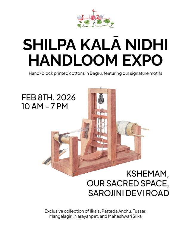
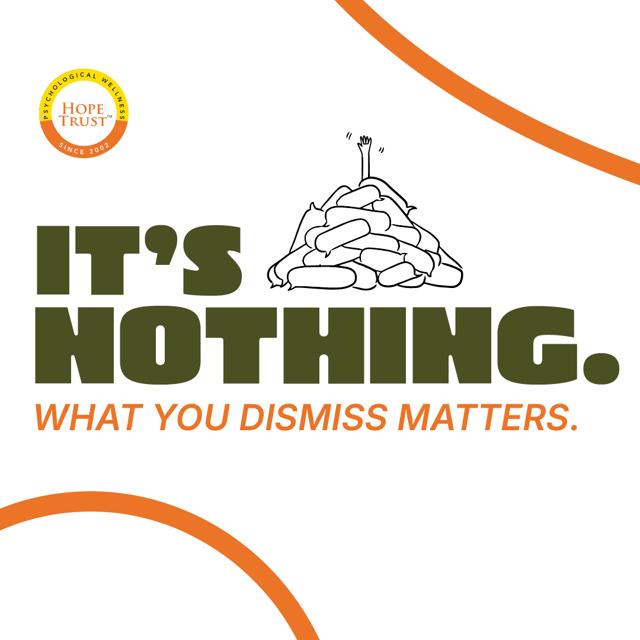
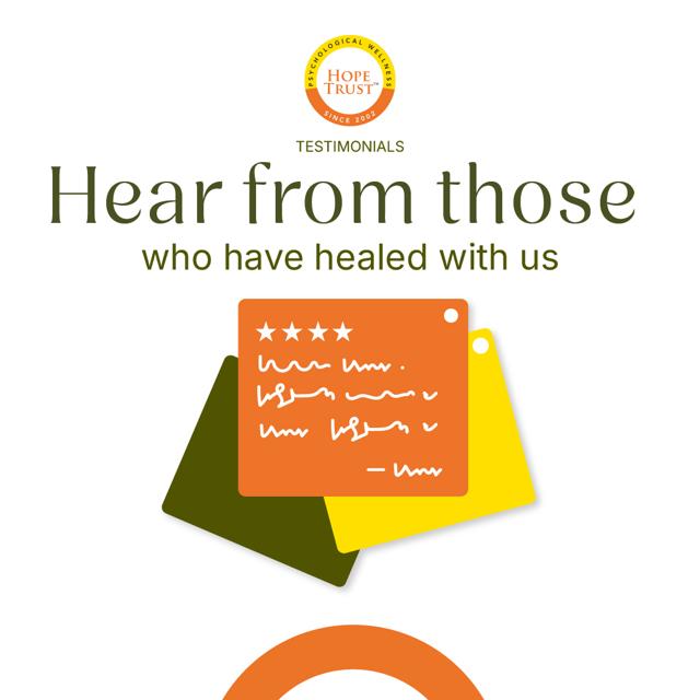
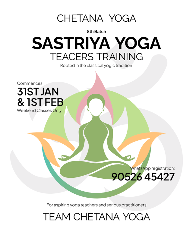
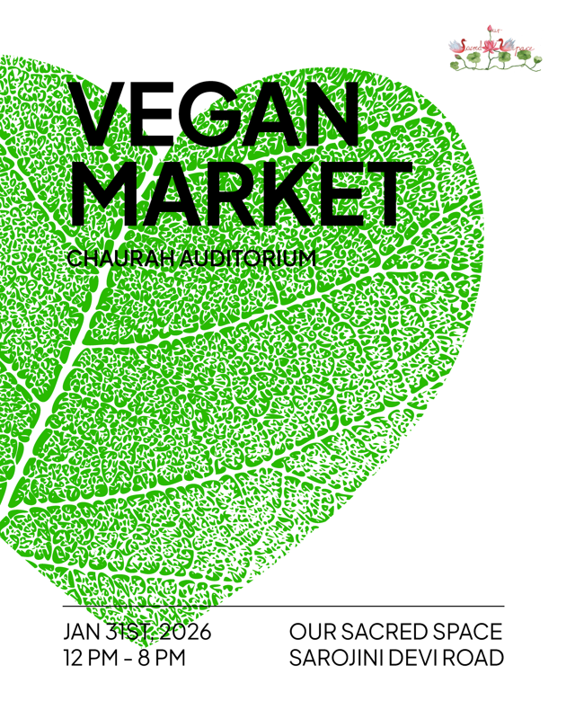
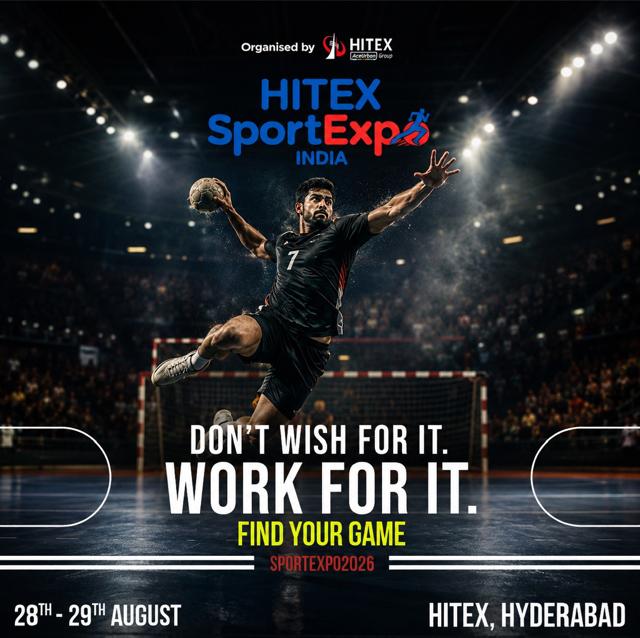
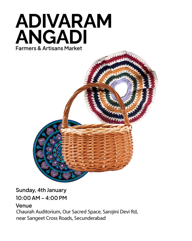
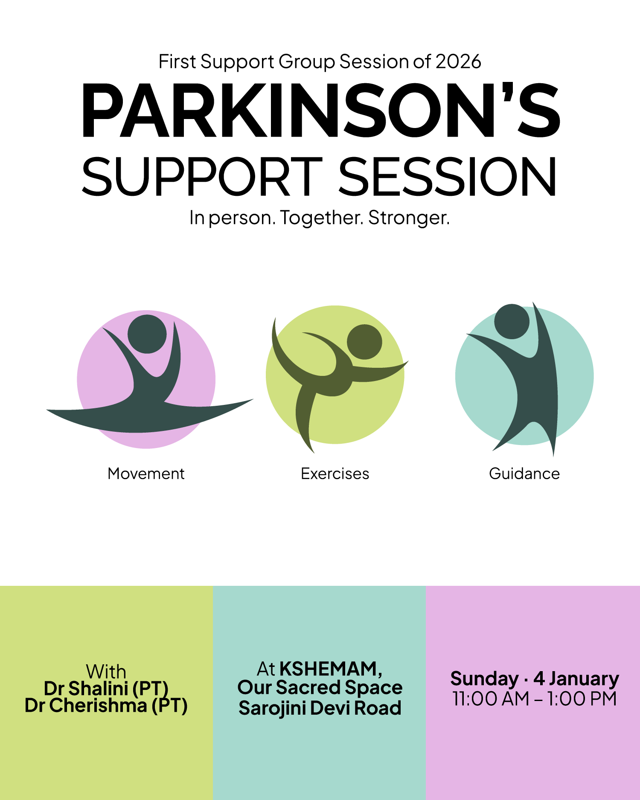
The campaign work above is real client creative — Adivara Mangadi, the Handloom Expo, Vegan Market, Sastriya Yoga, Find Your Game and a Parkinson's awareness campaign among them. They are deliberately different from one another: a heritage market, a trade expo, a health awareness push and a sports campaign are not served by one house style, and treating them as if they were is how an agency's work starts to look like its own portfolio rather than the client's brand.
What is consistent is the discipline underneath — one idea, placed on the path the eye takes, then rebuilt for every medium it has to appear in.
Common questions
What does a campaign or advertisement design cost?
It is quoted against the brief, because the number is driven by how many mediums the idea has to work across and how many formats each of those needs. A single press advertisement is a small job; a launch spanning outdoor, print, feed and email is a campaign. Tell us the mediums and the date and you get a real figure rather than a range.
Do you write the copy as well as design it?
Yes. Headline and body copy are written alongside the layout rather than dropped into it, because the length of a line and the space it sits in are the same decision. If you have an in-house writer, we work to their copy and tell them where it needs to be shorter.
Can you work to our existing brand guidelines?
Yes, and we would rather. Campaign work is stronger when it reinforces a brand people already half-recognise than when it introduces a new look every season — consistency is not a brand rule, it is the entire strategy. Send the guidelines with the brief and the work is built inside them.
How many rounds of revisions are included?
Two rounds at concept and two at artwork, which is what a decision genuinely needs. Unlimited revisions sound generous and usually mean the brief was never agreed — we would rather spend that time at the start, where changes are free.
Do you handle the printing and media booking?
We supply print-ready artwork to the publication or printer's specification and check the proof before it runs. We are not a media buying agency, so we do not book the space — if you have an agency doing that, we work directly with them on specs and deadlines.
Why does my call to action get ignored?
Usually because it is competing with something louder rather than because it is too small. The eye lands where contrast and isolation put it, and a button surrounded by four other emphasised elements is invisible in the second you are given — where the eye actually goes covers the mechanics.
The rest of what we do.
Let's make them
look.
// TELL US THE GOAL. WE REPLY WITHIN ONE WORKING DAY.
More on thisWhere the eye actually goes (and why your CTA is invisible)·The brief is the work. The design is just what's left.